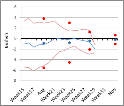
In case you didn't look at the previous post, the dots are the mean and +/- 1 standard deviation for the USDA of the error of thier monthly estimate compared to the final. The lines are the same for my uncorrected model.
Here are some state by state comparisons of my error bounds each week relative to those of the USDA. As you can see I tend to be fairly competitive up until the October report. After the October report my error bounds don't decline, because I'm getting no new information. Now of course my errors are in-sample and the USDA errors are out of sample, but my error bounds are very similar to the USDA when looking at the October report. There is still room and precedent for the USDA to make pretty good changes to the yield estimate after October. For instance, the graph for Illinois corn shows a standard deviation of the change from October to Final of 5bushels. For my bounds I'm showing the uncorrected model. The corrected model simply takes my mean error each week and centers it back on zero, so the width doesn't change, I just recenter it. These graphs also show that the USDA has historically had a pattern to their estimates as they are not centered on zero.


No comments:
Post a Comment